HW9
HOW, September/October 1999. Page 120
For today's blog, I talk about the most recent subject the class covered, color themes. As mentioned in the textbook, there are six different types of color schemes which are, monochromatic, analogous, complementary, split complementary, triadic, and chromatic color schemes. In addition, we also talked about primary (red, blue, and yellow), secondary (green, orange, and violet), and tertiary colors. With all of that now in our thought processes, we can now look at compositions while paying particular attention to the types of colors that are present. Or maybe not. Whether you analyze colors or not, we have some sense of the colors that are displayed before us.
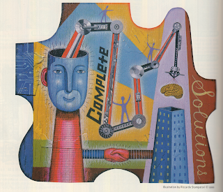
This art piece found in a 1999 copy of "How" magazine interested me in a lot of ways. I for one like compositions that have a wide range of colors. I also like the fact that the artist can use up space with out leaving any untouched areas in between. Those two previous sentences are the reasons that I chose this piece for my blog. The use of color is just stunning. You have a fair balance of primary, secondary, and even tertiary colors. The primary colors being red, yellow, and blue. The secondary colors being green and violet (very light purple). Then finally, the one tertiary color of brown. Everything else overall are the hues and intensities of the colors mentioned before. The mosaic is just a creative mess of colors.
The one thing I did have a hard time trying to piece together was what type of color scheme this piece was using because a lot of different colors were used. Since I am still learning about color knowledge, I would guess that the artist used a triadic color scheme system because there are different hues and intensities of the colors. At another glance, this could have also been based on the split complementary system. Either way, I will leave the readers to decide.


Comments
Post a Comment