Posts

HW14

Image
For today's blog, I cover non-commercial art, meaning that the art presented here was not created for a client, nor was it created for any monetary gain, but rather to be creative.  The art piece in this case depicts the late hip hop icon, Tupac Shakur.  I am not really into hip hop, however the fact that Tupac is one of the most recognizable figures in music history, it felt wrong to not choose him for this blog which is I chose this piece.  Though this is most likely a photograph that was heavily edited (likely using the same adobe programs we use), it still is an interesting combination of light colors. Even after learning about different color systems, I am still having troubles identifying what color system this uses.  The blue definitely easy to distinguish, but the brownish-violet and tan colors are what throwing me off with making a final answer. With using the textbook as a reference, this portrait of Tupac resembles some of the colors in the split complementary and t

HW13

Image
For this week's blog, I discuss the cultural cues in colors.  To be specific, the colors I have chosen for this blog are the colors that symbolize Mardi Gras.  Mardi Gras is celebrated in New Orleans and the event includes a huge parade where its participants are wearing and throwing bead necklaces that are green, purple, and gold.  Though I have never witnessed the Mardi Gras festivities in person, I have been to New Orleans a couple of times and have seen some remnants from past events.  So why green, purple, and gold?  What do these colors represent? According to the website where I also obtained the photo above, Mardi Gras is a celebration that takes place a day before Lent, which in Christianity is a time where followers give up something they like for about a month.  Each color is a symbol relating to Christianity and the culture in the south.  Green represents faith, which leans more into the religious aspect, purple represents justice, and gold represents power, meanin

HW12

Image
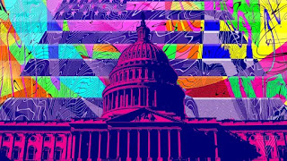
For this week's blog, I discuss a work art that breaks every color system in the textbook.  The following color systems, this piece deviates from include, monochromatic, analogous, complementary, split complementary, and triadic color systems.  It was not an easy assignment, believe me, but once I looked under psychedelic art, I knew I found good examples.  This piece for instance is just a mess of color, but sure enough, it was a good example.  It depicts a very purple tinted U.S. capital with an abstract version of the U.S. flag in the background.  Confusing? Yes, very confusing, but believe it or not there is actually a deeper meaning to this composition than what the eye can see.  According to the website I found this from, the piece represents government funded research on psychedelic drugs, which would explain why you get a psychedelic vibe in the background.  In the subsequent article, it talks about the very bleak future of psychedelic drugs.  Before this gets more p

HW11

Image
PDN, December 2014. Page 52 For  this week's blog, I talk about "creative" pieces.  Of course everyone here knows what being creative means, but it is a rather general term that can be applied to lots of different topics.  The topic of creativity for this blog focuses a lot on critique, particularly subjective critique, which involves a peer or instructor to look at the piece and identify the strengths and weaknesses. As mentioned in the textbook, subjective criticism  focuses on the the compositions meaning, emotion, intent, and relationships to different cultural events.  Unlike objective criticism , critiquing subjectively does not directly focus on simple observation, but it is more interpretive and thought provoking to say the least.  With subjective criticism, viewers can go deeper into what an art piece represents as a whole.  Such discussion does not always focus on the art, but it can also go towards emphasizing the current issues in society.  The p

HW10

Image
For today's blog, I discuss the rules in color harmony.  The types of color harmony include analogous, monochromatic, complementary, and color harmonies.  Unlike the previous blogs, rather than put a photo on top and explain the significance in the bottom, I will divide each paragraph with the photo that corresponds to it, so it would not confuse any of the readers.  Each rule mentioned here will have one photo, meaning there are going to be more than two photos to show. 1. Analogous colors Mentioned on page 48 & 49 of the textbook, analogous color schemes are the adjacent colors on the color wheel, which are green, blue-green, and blue.  The composition above is a great example of the analogous color system as it has a mixture of blues and greens.  In addition to the blue and green, there is some violet in there which is kind of a third wheel (or in this case fourth wheel) because it is an extra color to a three color combination.  The piece itself is unique in how

HW9

Image
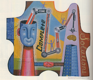
HOW, September/October 1999. Page 120 For today's blog, I talk about the most recent subject the class covered, color themes. As mentioned in the textbook, there are six different types of color schemes which are, monochromatic, analogous, complementary, split complementary, triadic, and chromatic color schemes. In addition, we also talked about primary (red, blue, and yellow), secondary (green, orange, and violet), and tertiary colors.  With all of that now in our thought processes, we can now look at compositions while paying particular attention to the types of colors that are present. Or maybe not. Whether you analyze colors or not, we have some sense of the colors that are displayed before us. This art piece found in a 1999 copy of "How" magazine interested me in a lot of ways. I for one like compositions that have a wide range of colors. I also like the fact that the artist can use up space with out leaving any untouched areas in between. Those two pre

HW8

Image
Communication Arts, January/February 2017. Page 101 For this week's blog, I cover positive and negative space.  Positive Space being the subject of the composition and negative space being the background.  I initially was confused at first when I saw positive and negative being paired with space.  At first I thought that it meant positive and negative emotions, but after some assistance from classmates as well as looking in the textbook glossary, I found out that positive and negative space meant the subject and background of a composition.  As all of us know, we just finished a Lynda assignment on how different colors represent different emotions, that was not the case so this was completely brand new to me.  I chose this photo off of an ad in an early 2017 issue of Communication Arts magazine and immediately thought it was interesting.  Not only is this a good example of positive and negative space, but the fact that the positive space was composed entirely of words made t