Posts

Showing posts from September, 2017

HW6

Image
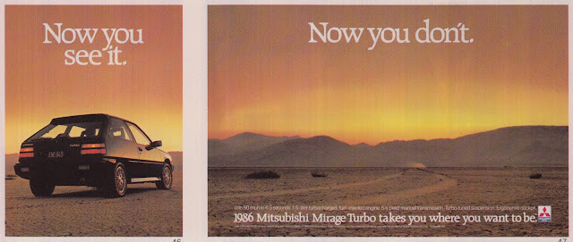
Print July/August 1986. Page 77 In today's blog, I will be discussing the depth that is found in this 1986 ad of a Mitsubishi Mirage Turbo.  Considering that it is a photograph, you will probably notice that the depth is presented in a one point perspective where nature (at least it appears to be) adds value to the composition.  As mentioned in the book, value is used to describe relative lightness and relative darkness.  The time this photograph was taken appeared to be around dusk which gives a fair amount of light for the viewer to determine depth. The setting sun in this case gives the photographer the relative light he or she needs to take the photograph.  It's enough to where you can still see the cracking texture of the dry desert dirt as well as the dark outline of the mountains in the distance.    I chose this photo because advertisements can be overlooked by viewers unless, for example, it was an ad for an event at a art gallery (those type of ads will

HW5

Image
Lurzer's Int'l Archive October 2015. Page 95 For this week's blog, I cover the topic of rhythm in compositions.  For people who have not taken graphic design or art classes, most would probably identify rhythm in relation to music and it's true, rhythm is an important structure in music however there is more to rhythm than just music.  Art pieces for instance can demonstrate rhythm as well through repetition.  In other words, movement in music can also be characterized visually. The painting above serves as a perfect example of rhythm, but at the same time it also shifts just like the notes in music.  Notice how the pattern begins with the Sydney Opera House.  I like to think of it as musical notes scaling down,  the highest note being the first depiction of the opera house and the lowest being the obscured castle towards the end of the bridge.  It's also important to note that the further away you look, the opera house pattern ends and turns into part of

HW4

Image
Artforum International, January 2014. Page 185 For todays blog post, I talk about the type of balance that is present in this painting above.  As mentioned in the book, there is symmetrical balance and asymmetrical balance.  In this case the painting above is an example of an asymmetrical balance.  I chose this composition because I liked how uniquely divided green and yellow were.  What makes this so asymmetrically balanced is the fact that the division between colors is not balanced.   There is a noticeable division between the top and bottom half of the composition so it would be easy to picture a balanced version of this piece, but it is easy to tell that the artist intentionally crafted this to be asymmetrical. Besides the uneven division, the piece also has blotches of white on the top right corner as well as the top border of the piece.  One thing to point out is that a symmetrical division would typically have an even layer of coloring, meaning that each portion woul

HW3

Image
Art in America, December 2013. Page 85 In today's blog, I look for some of the Gestalt psychology aspects of unity in this painting above.  As most of you probably know from last week's reading, there are six aspects in the Gestalt psychology interpretation of unity, which are grouping, containment, repetition, proximity, continuity, and closure. So which of these aspects of unity are present in this composition? Before I answer that question, let me tell you where I found this.  I stumbled upon this paining in a December 2013 copy of the "Art in America" magazine.  Unlike most of the compositions that were parts of an article, I found this off of an advertisement for an art fair that occurred in May of 2014. What got my attention was the fact that it had one of the most noticeable aspect among Gestalt psychology, repetition.  Simple as it may seem compared to the other compositions, this one had quite a bit of aspects to it.  Of course I also chose it simp